Crafting a Potion of Visibility
Spring break is nearly upon me and as such, a transition from a final research paper into a class around social media. This post represents both a capstone and a new beginning. Below are social media teasers mocked up as they would approximately look in Twitter, LinkedIn and Instagram for my upcoming long-form writing assignment with the working title of “Crafting Better Multimedia for the Invisible People All Around Us”.
The article will cover the trouble multimedia presents to those with invisible disabilities with a focus on those that are cognitive. This topic extends my prior work at conferences speaking broadly on accessibility, but with a focus on visual, auditory and motor disabilities. A goal of the article will be to shine light on invisible disabilities while expressing what those in mentoring and senior roles can do to improve content built for the web and beyond.
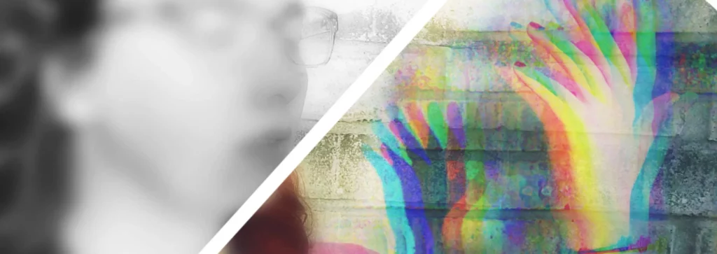
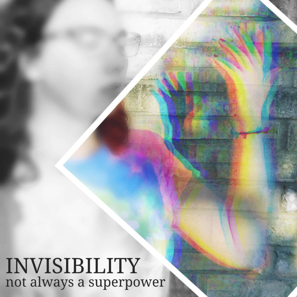
Each of the following social media previews uses an image of myself with a semi-transparent digitally glitchy seeming appearance on the focal point of my arm. The intent of the image is to be unique, eye catching, human, and convey a something being not quite right. The image is paired with copy and various visual treatments depending on the platform.
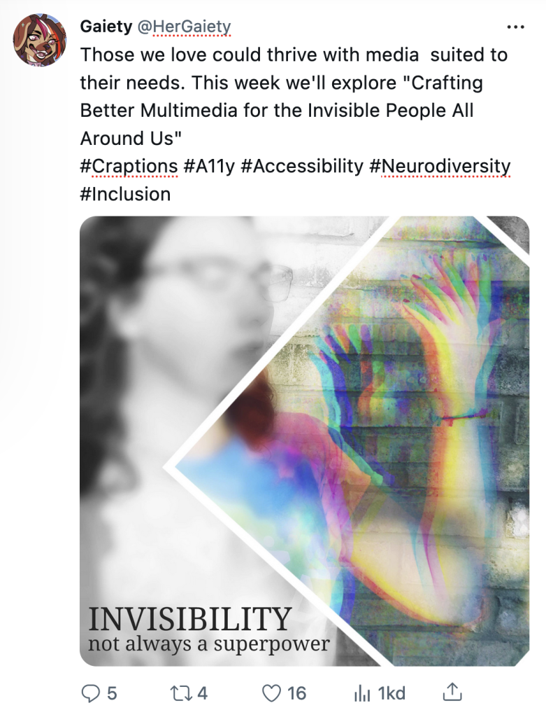
For this tweet I’ve went with a 1:1 ratio square image preview with an eye catching diamond color highlight to my main image. A fun tagline was added to the image and the tweet itself contains thought provoking language along with the title of the upcoming article.
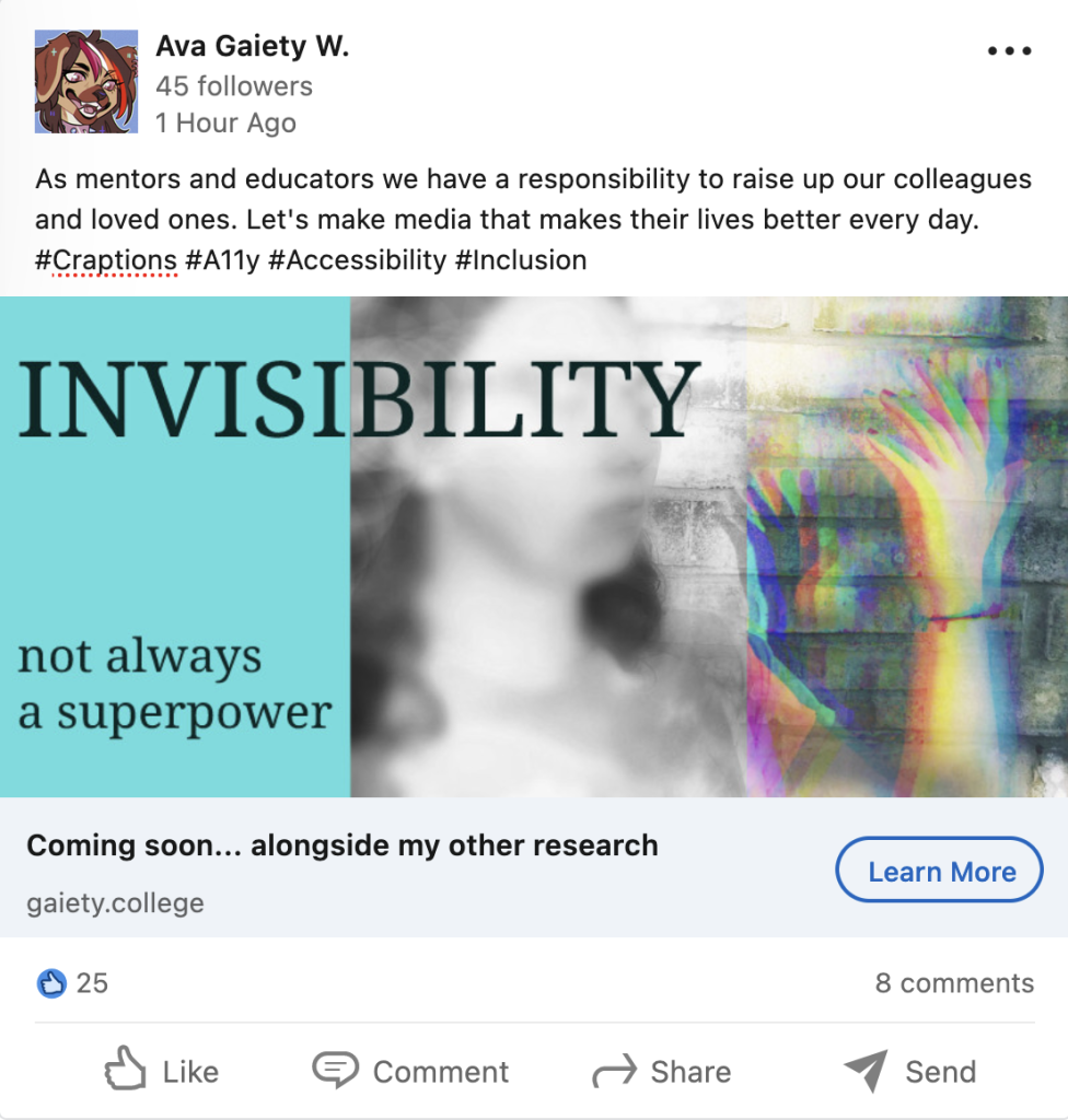
LinkedIn is generally filled with vector graphics that are practical rather than artistic. In an effort to keep to a semi-consistent image across all platforms I’ve made a solid color 1/3rds width side bar in an image with a strong horizontal ratio visual. The intent with the copy overflowing from the box is to adhere slightly to the LinkedIn aesthetic while breaking the boundary into something different.
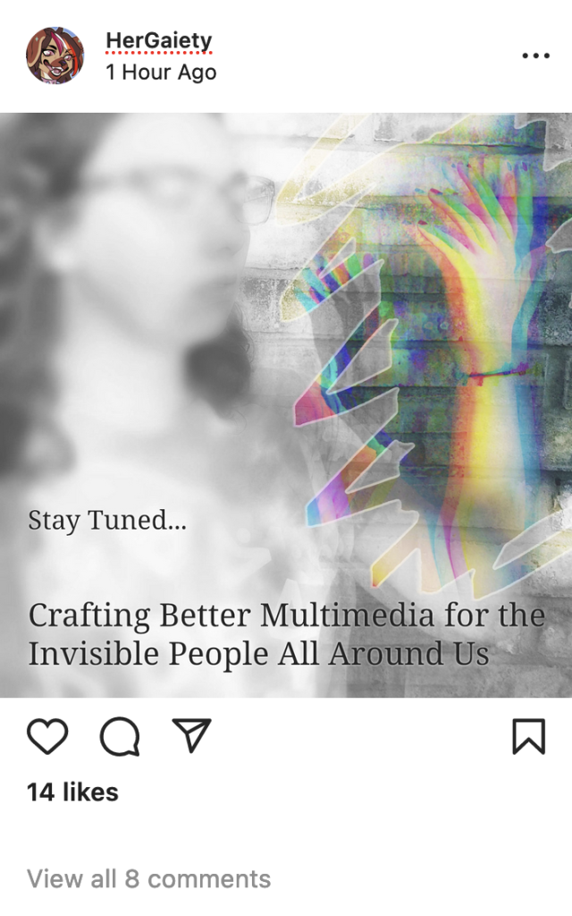
The most fun for last, a very visual and artistic medium like Instagram has been given a painterly treatment to the main image. As images tend to stand on their own without accompanying copy this image tries to only tease the name of the upcoming article while leaning on the visual to be compelling on its own.
In the end I’m overall satisfied with these social media previews to tease the upcoming article. I may adapt one of these for my casual Mastodon presence as it is the only real social media presence I have. The image itself will likely be a captivating cover image for the Medium.com article and the way I’ve advertised the content here may influence the way I write the content.
Special thanks to MediaModifier for the easy to use preview templates
