
Stories Within Data Visualizations
Reading A Brief History of Data Visualization by Michael Friendly (2008) lead me to the one responsible for my beloved and simultaneously hated pie chart (William Playfair, Howard Wainer, Ian Spence, 1801), while also elegantly defining the most influential and prevalent charts I see in my every day. My love-hate relationship with pie charts stem from their modern over-use, when they have too many data points to meaningfully compare visually, and when they aren’t used to tell a meaningful story.
In my career as a web engineer I build many user interfaces and these often come with presenting data through a graphing framework such as Highcharts. Alas, often times at startups I’ve frequented there may not be budget to hire a quality assurance team, a designer, let alone a data scientist. Thus often times I’ve found myself, against my better judgement, overfilling “pretty” pie-charts with far more data than they can hold while still conveying a story. Computers are very good at letting you choose a type of chart from a list leveraging most any data you already have. It’s just as easy in Highcharts to use a pie, bar, or column chart. But Highcharts, Excel, and other tools don’t handhold you to display the data visualization in a way that ends up being meaningful. They’re just tools, it’s up to the story crafter to use them appropriately.
That’s what a good graph should do, tell a story while conveying understanding. My most memorable example that lead to a eureka moment was in Physics 101 at Anne Arundel Community College learning the differences between velocity and acceleration over time and distance. We, the students, were lucky enough to learn this by watching a computer with a laser distance sensor measuring the movement of a toy car in real time. Our toy cars were the actors in a story unfolding in data and graphs before our very eyes.
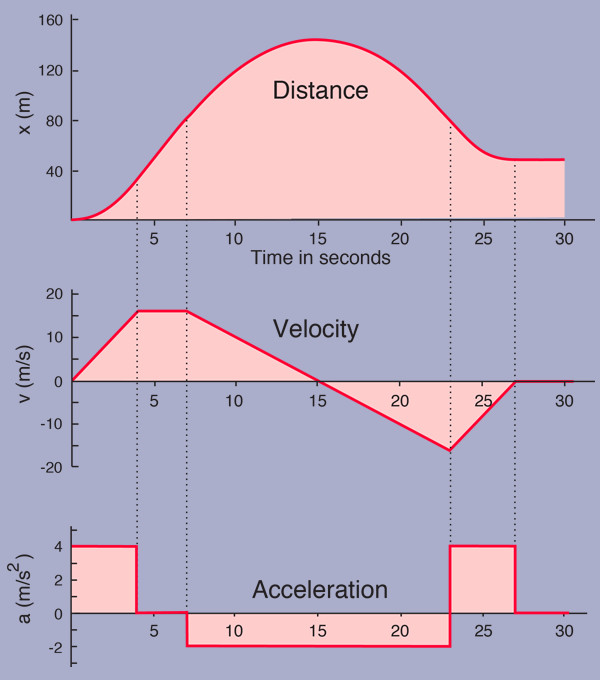
Above graph of Distance, Velocity and Acceleration is from Motion Graphs, their site has a deeper breakdown of how to reach the graph for even more information.
The true horror of not telling a quality story is doing a disservice to quality data. Michael Friendly describes two differently received graphs of similar importance to the population at the time. While Dr. John Snow’s graph was well received, conveying “…[the] deaths due to cholera clustered around the Broad Street pump in London”, while Dr. Robert Baker was unable to have his audience reach a similar eureka moment with his own publication twenty-two years prior.
What makes a data visualization is the storytelling. Great graphic design reaches into the reader deeply to help them arrive at their individual moment of total understanding. An image can say a thousand words, but a good graph can tell so much more.
Michael Friendly (2008). Handbook of Data Visualization, doi: 10.1007/978-3-540-33037-0_2
William Playfair, Howard Wainer, Ian Spence (1801) Commercial and political atlas and Statistical breviary. ISBN: 978-0-521-85554-9