
Viz Varieties, Categorizing Data as Graphics
Together reader let’s, you and I your author, journey through a landscape of data visualizations. We’ll hope aboard a roller coaster that may or may not be itself in the shape of a smoothed line graph. Never fear, this roller coaster will not be of the emotional variety.
Conceptual Declarative
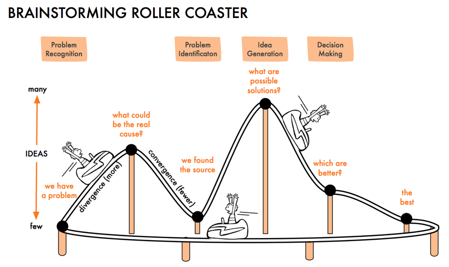
We will begin with a Brainstorming Roller Coaster (Paul Williams, 2019). Even, as the author declares, a silly visual can convey useful information. In the below graph a smoothed line graph is shown with multiple key moments including “what are possible solutions?” which coincide approximately with an X axis of time and a Y axis of the number of ideas. The message conveyed by such a graph hopes to instill understanding of an idealized process of brainstorming many ideas to an identified problem while reaching, hopefully, the best idea as a solution. While this could have been conveyed in a page of text, the information is condensed into an engaging memorable visual.
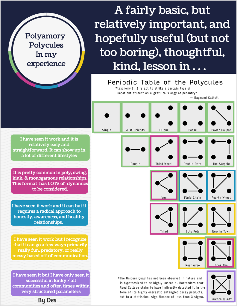
Another example, shown below, of leveraging visuals to convey information from the designer to the reader can be found on my coworker and friend’s Periodic Table of the Polycules (Desmond Seymour, 2022), an excerpt from his Polyarmory Simple Guide. Again, while plain text could have been used to list out various forms of relationship dynamics, Des instead visualized each person as a circle with, or intentionally without, connecting lines between them to indicate a relationship dynamic. Then, each dynamic has been color coated and related to his personal insight on the category.
We reach the first noteworthy point in our roller coaster of understanding of data visualization with the previous two examples being known as Conceptual Declarative visualizations. These forms of visualizations convey information using graphical representations to convey theoretical concepts not through hard data but instead through relationships tied to ideas. A Conceptual Declarative visual might be used to pitch a product or educate an audience on a topic in a way that may be memorable and less dry.
Conceptual Exploratory
Diving lower on our roller coaster ride we reach a similar series of examples as we saw in Conceptual Declarative where there is a desire for the designer to understand, but perhaps they do not yet. In such a situation sketches and approximate design ideas are explored to see if they are on the right coaster track to soon becoming more declarative. This means that often before a Conceptual Declarative graph is made we may make one or many Conceptual Exploratory data visualizations.
Throughout my career I’ve worked with teams on the exploration of how to present potentially complex data. The below example is one from Allovue that ultimately did not get implemented in code within the final product. There may have been sketchbook sketches before this high fidelity graphic was designed, but alas I do not have access to those to show them here.
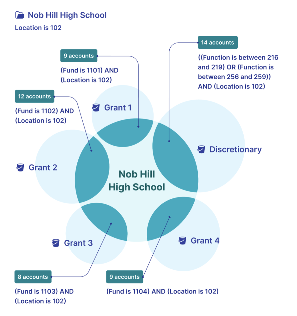
(Note, in no way are these real numbers associated with a school of the same name)
Data Driven Exploratory
Halfway through our coaster ride we leave behind the world of the conceptual and enter the realm of real data. Sometimes a designer has hard data, but exploration is still required to make meaning of it. In such a situation Data Driven Exploratory data visualizations can be made.
![Cueball is pointing at a line graph at a specific point where it slopes down. The y-axis shows that as y increases, love increases. Cueball: Our relationship entered its decline at this point. Megan [Outside of panel]: That's when you started graphing everything. Cueball: Coincidence!](https://gaiety.college/wp-content/uploads/2023/07/decline-xkcd-graph.png)
Your author faerself is currently parsing through data in some of faer own data gathering while creating exploratory visuals tied to this hard data. Fae hopes that at the end of the process fae will arrive at being able to make something more declarative.
David McCandless tells a lot of great stories through his, and his team’s, data visualizations. Often times, however, he’ll create tools driven by real world data that let the viewer find their own story within it. Interactive data visualizations offer a way to explore data by traveling through time and filtering down to just the relevant data that satisfies a viewer’s curiosity. After any data collecting it’s important to follow up with any original hypothesis the data collector had. Then it’s important to follow-up with additional questions that may arise from exploring the data. The next step after exploration, might be to create a Data Driven Declarative visualization.
Data Driven Declarative
The final hill of the coaster is upon us, welcome to the everyday dataviz also known as Data Driven Declarative data visualizations. These graphics are backed by hard data carefully collected, parsed, cleaned up, and visualized in a way that hopefully best communicates a data driven story.
If [an everyday dataviz] can’t speak for itself, it has failed like a joke whose punch line needs explanation.” (Scott Berinato, 2016, pg 67)
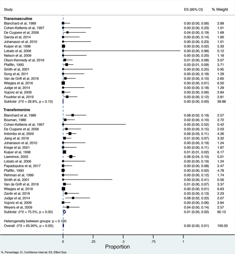
“A total of 27 studies, pooling 7928 transgender patients who underwent any type of GAS… [with a] regret after GAS was 1%” (Valeria P. Bustos, et al., 2021) “…extremely low prevalence of regret in transgender patients after GAS.”
Learning the successes that come from the conceptual, the exploratory, the data-driven, and the declarative allow designers to understand what tools are relevant for their current needs.
Desmond Seymour (2022) Polyamory Simple Guide by des
Paul Williams (2019) Hop Aboard The Brainstorming Roller Coaster. Idea Sandbox
Scott Berinato (2016) Good charts: the HBR guide to making smarter, more persuasive data visualizations
Valeria P. Bustos, Samyd S. Bustos, Andres Mascaro, Gabriel Del Corral, Antonio J. Forte, Pedro Ciudad, Esther A. Kim, Howard N. Langstein, Oscar J. Manrique (2021) Regret after Gender-affirmation Surgery: A Systematic Review and Meta-analysis of Prevalence. Plastic and Reconstructive Surgery – Global Open | doi:10.1097/GOX.0000000000003477