Thinking about Video, Montage Pre-Production
Readings & Writings
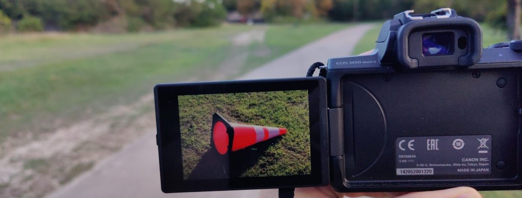
Continuing my readings into Tom Schroeppel’s (2015) The Bare Bones Camera Course for Film and Video. Firstly my mind was blown while finally coming to a deeper understanding of what the stranger looking camera settings, or film options, really mean as it relates to f/stops and color temperature; which I’ve written about in my TIL blog. There’s a reason for how F/16 and 8000K relate capturing images from light after all. One thing missing from this blog entry from Schroeppel’s first chapter that peaked my interest is his explanation that, “Your depth of field decreases as you increase your focal length [when measured optically]”, before going on to explain how that then ties back to f/stops.
Chapter two revisits many well trodden guidelines to what makes good art and design including the Rule of Thirds, balance, and more. An interesting callout was what Schroeppel refers to as frames within the frame with examples such as using a tree and its branches to cover a top, corner and side of a photograph or literally including a window within a photo. This takes me back to a favorite topic of mine all about how frames, be they literal or a frame of mind, have an effect on how the viewer interprets a photograph (Note I went by a different name and gender in 2014).
As a person with motion sickness I was struck by chapter five letting me in on a secret to solving a problem introduced by a panning camera, “An effective way to lead your viewers through a long pan is to follow a smaller object—a person walking, a car perhaps— as it passes by your subject. When I must look away from the screen in a movie it’s often because a director wants me to see a wide vista, but it leaves me feeling like I am in the backseat of a car without anything clear to focus on to give me a sense of place.
Lastly chapter six is on the montage, which is what I’ll now focus the rest of this blog entry’s journey on for next week’s project. I have created an audio and video montage thirteen years ago… but it has not aged particularly well, which is a good thing as it means I have learned much since then! In particular I’ll stop distracting the user with a shaking camera by using a tripod or similar surface to still my camera, using only intentional camera moves when I intend to. My shots were wildly different, but not in an intriguing way. I intend to storyboard with intentionality rather than following my whimsy with no bounds. When shots are similar to one another I’ll be intentional with a “…variety of angles and image sizes…”.
With intentionality in mind I would like to prepare for next week’s video montage project by narrowing down my audience and working towards truly understanding what my “big idea”, in Jimm Fox’s words, entails. While I will likely be working alone primarily, this article reminded me I can ask my friends to help brainstorm what I’ll be creating. Who better than the friends who will be accompanying me on my upcoming weekend trip where I may shoot footage! Another thing I took to heart while reading Fox’s words is, “How long do you need to get to the point of your video?” which is a superb way to consider what my length of the video will be in a less abstract way.

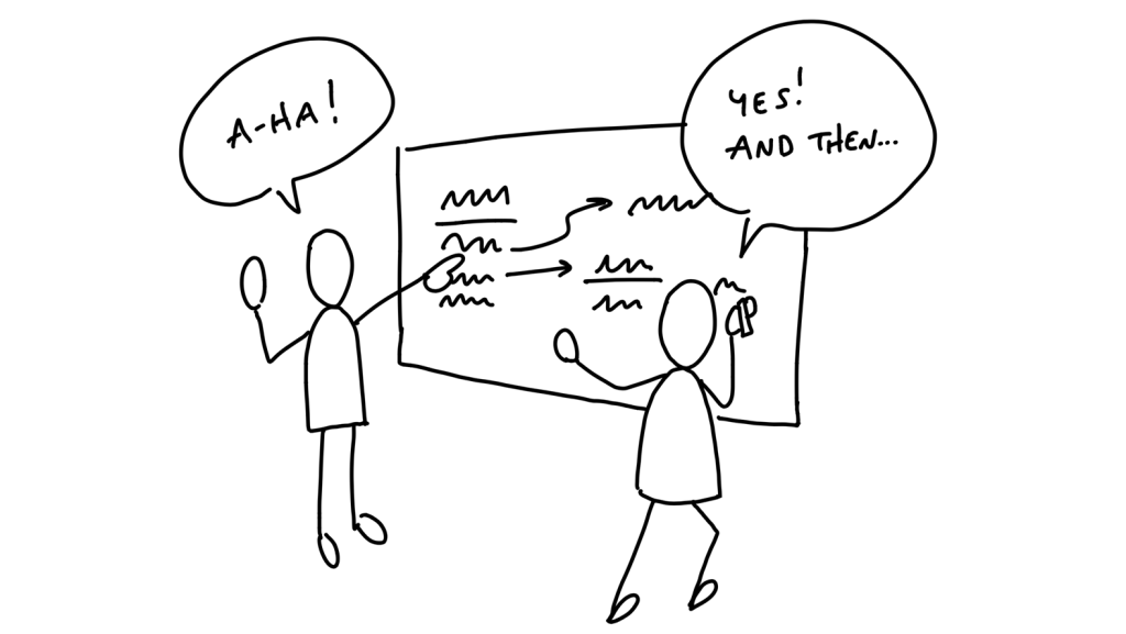
An upcoming challenge I’ll face is that I have aphantasia and thus cannot visualize specific locations at the Texas Renaissance Festival, where I am hoping to shoot my montage. Luckily I can still do some rough planning through sketched storyboards to improve the intentionality of the footage I capture. I may not tell a linear story about a specific individual, and thus it may be ideal to lean into crafting strong yet varied visuals leveraging what I revisited in chapter two of the book mentioned previously. I plan to recall simple elements I know exist at the location such as the bridge, two story buildings amongst the trees, tents with campers, people in exciting costumes and more. I can use these recalled vague ideas while putting into practice what I’ve practiced in the workplace drawing fat marker sketches to not overly define my shots while still getting the point across (from BaseCamp’s ShapeUp).
Research to Inform
Let’s look at some existing video montages to see what we can learn!
Starting off with the above video montage by yours truly called Vapor. This was a project I made a decade ago and it’s still one I enjoy watching for it’s engaging visuals tied together with curious audio. While potentially overly poetic, as purely an art piece it’s a satisfying experience on the eyes and ears. Some visual tricks I used for this piece was to create motion through blending together photographs combined with my own simple graphical effects in After Effects. While this is a different experience than what I plan to create next week, it’s good to reference what I’ve done in the past. At around 0:28 I feel balance well by offsetting the tree to the bottom while lights distributed overhead, despite not considering the golden ratio or it’s related sibling the rule of thirds. The rest of the imagery is more about color and texture, so let’s look at other examples we can find online…
I listen to a ton of LoFi while I work. When most people hear the term LoFi they immediately jump to the longest running stream lofi hip hop radio 📚 – beats to relax/study to and I think there’s a reason for that; strong visual composition with the main character gently animated just off-center with an arm outstretched to the left to have her feel in the middle but optically she’s more interesting. In the above embedded video by the channel Chillhop we see a unique top-down perspective. If we were to apply the rule of thirds here our character is much smaller and places beautifully in the top right corner in a visually appealing location. Both videos intentionally make use of a window frame behind the character which further frames the outside world, which depending on the channel may change day-by-day or by stream.
Lastly we can look at Scratch21’s official music video of Aleeyuns (aliens). In this video we are met with en engaging visual of the main characters of the band playing atop of a speeding van, presumably in the Nevada desert. What has always intrigued me about this composition is that it gives itself plenty of space to breathe, or “noseroom” as no one is being threatened of being cropped out of frame at any time despite the vehicle’s bobbing on the rough road. It’s a very practical solution for a video that wants to display highly legible real-time lyrics onscreen at the same time.
Create — Scavenger Hunt
Practicing photography skills through various forms of shots, balance, framing and more! Enjoy this turkey…

Create — Pre-Production Guide
The following pre-production guide for next week’s video montage is not entirely finished but is a solid start for the footage I’ll collect this weekend. I hope to go back and fill in the script and storyboard, but right now I am completely burnt out and getting as far as I reasonably can.