
Solar Ranger, an Electric Car Data Viz
Over the prior three years I have been going green. Aside from the energy efficient home windows, roof and insulation there was another story I wanted to tell around electricity. I’d like to tell a story through data visualization about indirectly charging my Hyundai Ioniq 2019 EV via my home’s solar panels.
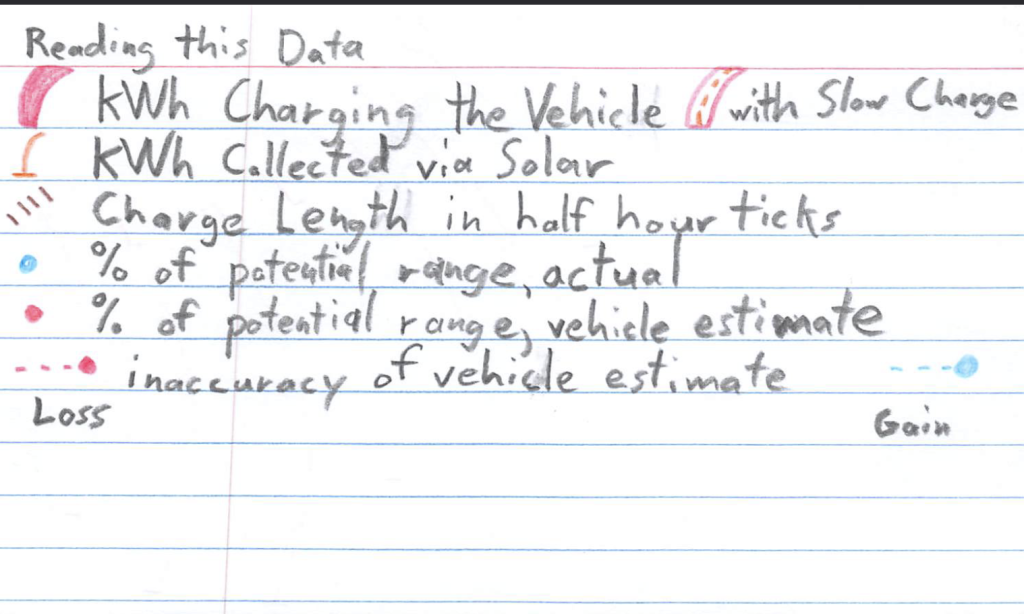
Step one was gathering data. I used [Obsidian](https://obsidian.md/) to track some notes on the go such that I could sync them back home later. I tracked the Date, Vehicle’s Estimated Start and End Range in miles, Actual Trip Distance in miles, Charged Overnight? as a Yes or No, Solar Produced in kWh as logged by my panel’s solar tracking app, Vehicle Battery Charge in kWh as tracked by my Chargepoint charger and it’s app, Charge Length in hours, and any notes. It became common that I’d throw out data where I did not charge my vehicle overnight, or when I lacked data from my Chargepoint charger while out of town.
Solar Power to Vehicle Charge
My first attempt at a story through this data was focusing entirely on comparing my total solar panel intake, ranging between 50.2-59.3 kWh, to the amount of charge my Chargepoint charger indicated flowed into the vehicle on the same day. For fun, I added the charge length and noted when I was using a slow charger.
An oddity of note here is the first time I noticed my Chargepoint app indicating it was filling my vehicle with over 50 kWh despite the battery on the vehicle being between 28-35, depending on the source I found for my vehicle. This should not be possible, so I must assume the app calculates the energy flowing through the cable rather than how much the vehicle battery could hold or needed.
How Accurate is my Vehicle's Range Tool?
Next, leveraging my data I wanted to know if the giant number on my dash, which claimed to estimate how much further my vehicle could drive, was accurate. I ran this data through several iterations (Iteration One and Iteration Two) before munging my data into something coherent using percentages from a full charge. This involved doing some math with my starting range, ending range, and actual trip distance, but the result speaks volumes.
I read this chart with the hope that the dots would be overlapping each-other on the same spot. If they did overlap it would mean that the range estimator was perfectly accurate. The chart highlights in red the amount the estimate is incorrect, compared to how far I actually traveled.
The estimate could be off for a number of reasons. Firstly, I collected all of my data consistently with the air conditioning on which the vehicle seems to account for, but it could be inaccurate. In retrospect I wish I had tracked my average MPH as I imagine my vehicle has an ideal speed to drive at. Lastly, there is a data outlier where I was driving back home and my actual distance exceeded the estimate.
Exploratory Full Story
I had hoped to bring these stories together into a full graph. However, the amount of data munging to make it possible not only was a headache, but more importantly resulted in a messy graph that did not tell a coherent story. Thus I instead leaned into doing some art with the two separate stories I had been telling...

Above is the final notecard data visualization I've come up with. I'd love to revisit this some day to better integrate the percentages and tie together the stories. But for now, I really enjoy the imagery of the sun emitting solar data and the simple beauty of the dot graph.