
Authentic Data Narratives to Persuade
Data narratives are just that, stories. The best stories paint a mental picture, or show a literal data image in some cases of what is being told from narrator to the reader. These pictures are compelling—but what if we want to be persuasive as well? One method we must be careful of are warping data to fit a narrative they don’t truly tell, although little half-truths like maps distorting space for clarity can be helpful. Just as Harvard Business School puts much emphasis into giving persuasive presentations so too is it important to present our data narratives with conclusions that can persuade.
Today, many graphics explain nothing. They just present data, and the reader is expected to work out their meanings. Charts that don’t explain themselves are worse than no charts. “Information must inform” has become a cliché, but it’s right.
Kirsten D. Sandberg and Nigel Holmes in Easy on the Eyes pg 19
“I knew data would convince you…”, well it ends up being the framing of the data with context and a story that ends up being truly persuasive. Purdue University’s On-Campus Writing Lab’s Effective Persuasion Presentation concisely describes, “Persuasive writing seeks to convince its readers to embrace the point-of-view presented by appealing to the audience’s reason and understanding through argument and/or entreaty.” (slide 3) Data on its own isn’t the full story, but it should instead be used to “support your opinion… find common ground… [and] establish your credibility” (slide 4).
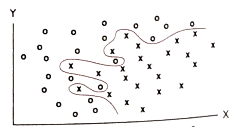
Credibility is important for persuasion as the audience isn’t dumb and has every reason to instill doubt in what they are reading. Edward Tufte’s Beautiful Evidence page 146 references a parody diagram (shown below) by C.M. Bishop, “…mock[ing] a fussy over-fitted model (the [curving] line) wandering around the data space picking up every little piece of stray variation. Built on the quicksand of idiosyncratic and random variation rather than the rock of predictive casual theory…”
Cherry-picking evidence that fits a narrative a data narrative’s author desperately wants to persuade the reader of can lose the author all credibility and thus any chance of being persuasive. The gentle lies that a map tells to more easily convey complex information are on a different plane altogether from producing fake news through data corruption.
Authenticity powering a well told story is the key to telling a compelling persuasive data narrative. When you have great data that is only half of the goal accomplished. Making facts memorable and known a great story can help it spread. It was said best by Courtney Marchese in Notes on Storytelling and Visual Cues “When facts are visualized, they are harder to reject.” (page 8)
Featured image is a photo taken by this author Ava Gaiety W. on top of a printed book Communication Arts Illustration Annual 54 on page 141 of art by Olimpia Zagnoli